Brand Identity & Mobile App
Research, Information Architecture, Interaction, Brand Identity, Visual & Systems Design
Overview
As the STEM summer camp Galileo grew to a national chain, it became increasingly important to maintain a consistent style and visual language across all communications and products. With over 70 field staff needing customized graphics, it was clear that we needed to provide a suite of branded templates they could personalize themselves.
The initial goal was to have a library of reusable components, guided by clear usage rules, that could be combined to create designs to fit a variety of uses.
To make camp more accessible we needed to modernize our website so that customers could purchase our camps on mobile.
New Attitude: Bold & Playful
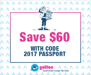
Bringing in a bold playful tone, I developed brand guidelines for Galileo. Whimsical patterns, bright gradients and lots of white space dominate the new design style. I developed the ui for checkout system for mobile and desktop in addition to ads, illustrations, animations and templates for the staff.

Exploration of Styles

Style A: Hand-drawn, Textures

Style B: Pattern, Hand-drawn, Photos

Style C: Textures, Hand-drawn, Photo filters
Final Looks
Whimsical patterns, bright gradients and lots of white space dominate the new design style.


Illustrations
Each year, Galileo camps have classes in four unique themes. To match the refreshed branding, I created illustrations and animations depicting the themes.
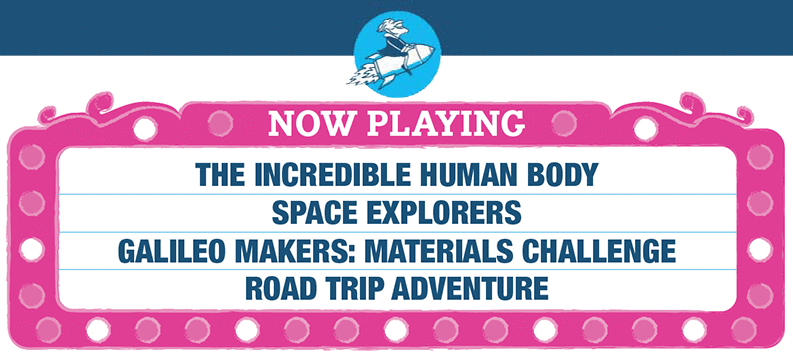

Theme: Maker

Theme: Road Trip

Theme: Space

Theme: Human body
Mobile design
Galieo wanted to give their customers the ability to use any device to purchase weeks of summer camp. I worked closely with our Salesforce Admin, Head of Marketing and outside engineering team to redesign the shop experience.


